Creating and Formatting a Chart in PowerPoint or Word with Spotlight for Office
- 3 Minutes to read
- Print
- DarkLight
- PDF
Creating and Formatting a Chart in PowerPoint or Word with Spotlight for Office
- 3 Minutes to read
- Print
- DarkLight
- PDF
Article summary
Did you find this summary helpful?
Thank you for your feedback
Word and PowerPoint natively offer the ability to create charts in the document or slide deck. They provide an Edit Data window that looks like an Excel workbook where you specify row and column headings and data to be represented in the chart. Spotlight for Office makes it possible to use Spotlight formulas in the Edit Data window and then select those cells as the range to be used in the chart.
Start Word or PowerPoint and open the file that contains the Spotlight for Office metadata and data items.
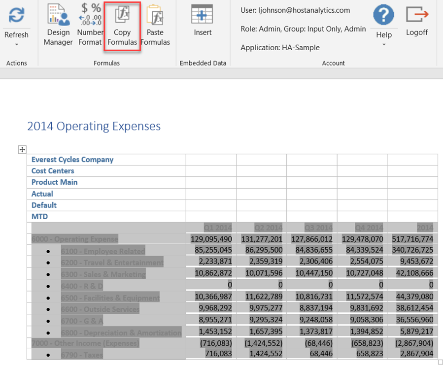
Select all the cells and click Copy Formulas from the Spotlight ribbon. Do not select POV cells.
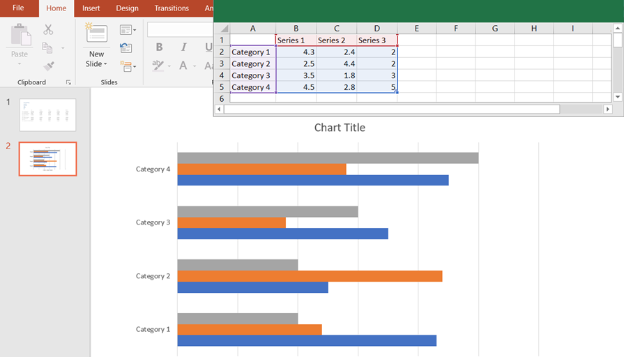
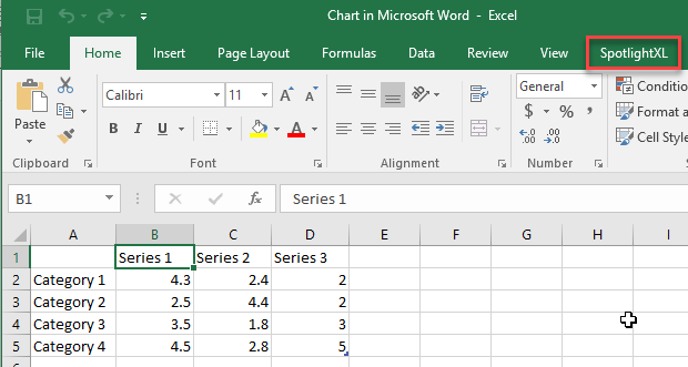
Put your cursor in a blank area of the document or slide and insert the type of chart you want. For example, in Word, select Insert, Chart, Bar, then click OK.
The chart is inserted with a set of preliminary data (dummy data), which is displayed in an Excel-style sheet.
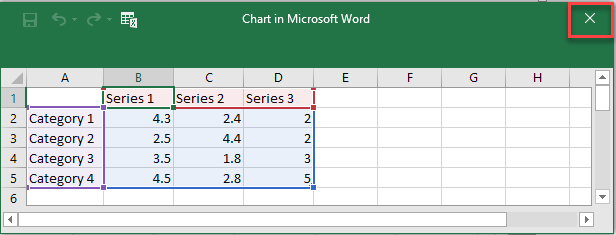
Click the X to close the Excel sheet.
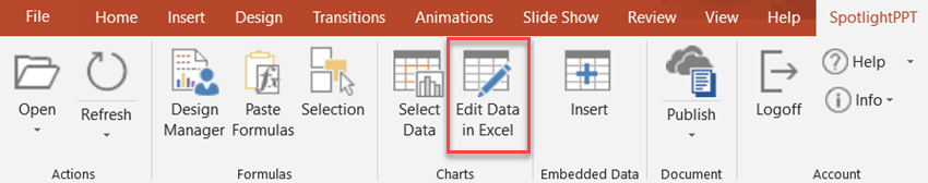
On the SpotlightWord or SpotlightPPT ribbon, click Edit Data in Excel. The Excel-style sheet reappears, this time as a complete workbook with an Excel menu.
Click the SpotlightXL menu item to see the SpotlightXL ribbon.
Select all the preliminary data in the sheet and press Delete to remove it. You should now have a blank sheet. Select cell A1.
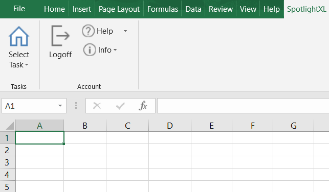
Click Select Task and select Excel-based Report.
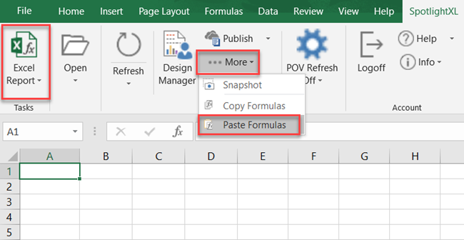
Click More, then Paste Formulas.
The formulas (metadata and data) that you copied from Word or PowerPoint are then copied into the sheet.
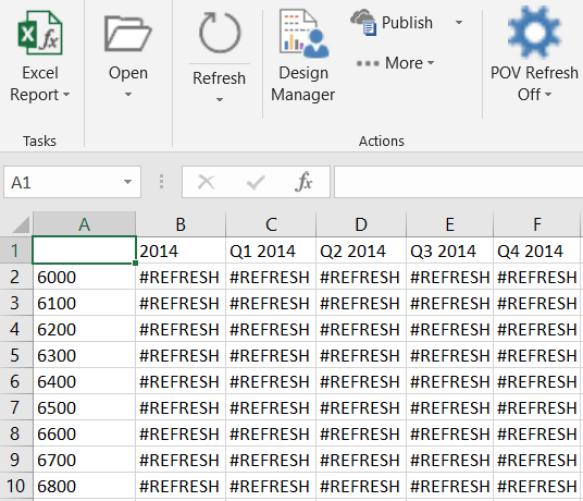
Note:If nothing is pasted, you can switch back to your Word or PowerPoint window, select the cells, and Copy Formulas again. See Step Data appears as #REFRESH. There is no need to refresh the formulas at this point.Note that the formulas pasted in the image below end at cell F12.
Click the X to close the Excel sheet. This saves the data in Word or PowerPoint. Now you need to tell Word or PowerPoint that this is the data you want in the chart.
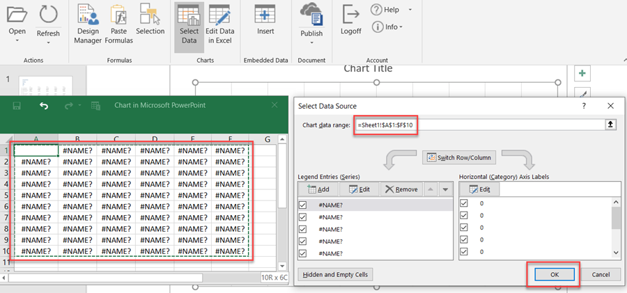
Back in Word or PowerPoint, select the chart and then click Select Data from the Spotlight ribbon.
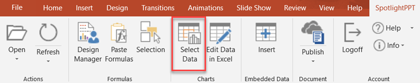
Once again, the Excel-style sheet reappears. In it, you see #NAME? for each metadata and data formula that you pasted in step 9.
To confirm, we see that #NAME? appears in cells and ends at cell F12.
Note:In a future release, #NAME? will be replaced with the appropriate values.Highlight the cells (A1 to F12) and you see the range dynamically filled in the Select Data Source dialog box. Click OK.
Click the X to close the Excel sheet.
Back in Word or PowerPoint, your chart should still be selected. Click Refresh. The chart is now populated with data and you can fine-tune the layout and presentation of it.
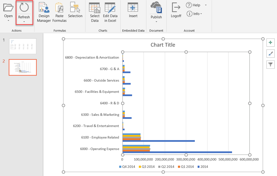
The chart is connected to the data source in Dynamic Planning and you can click Refresh to update the data regularly.
Other chart options:
Once you have a chart in place that is connected to the data source in Dynamic Planning, you can copy and paste the whole chart to another page or slide in Word or PowerPoint. Each copy of the chart is a separate instance, so you can change the dimensionality displayed in each chart independently. For example, if you set up the first chart to view all 2018 data, you can make copies of that chart to view individual quarters of 2018.
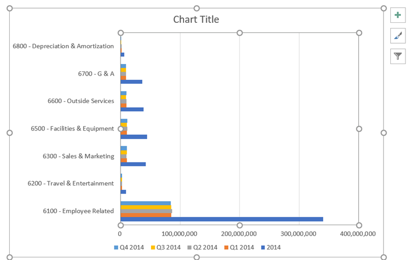
- To make changes to the data you are seeing in the chart, use the Edit Data in Excel button to edit the rows and columns of data. For example, in the chart above, account 6000 is the Total Operating Expense, and account 7000 is Other Income (Expenses). I can remove those rows so that I can see only the categories of expense in the chart.
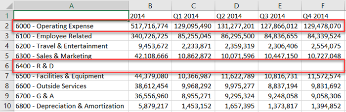
The chart looks better without those accounts.
Was this article helpful?