- 3 Minutes to read
- Print
- DarkLight
- PDF
Using Dynamic Report Chart
- 3 Minutes to read
- Print
- DarkLight
- PDF
The Dynamic Report Chart type in dashboards allows you to add table charts using Dynamic Reports. You can now leverage the dynamic report functionalities while inheriting the data and formatting from the dynamic report.
You can build the dynamic report with the required data and formatting, and then use it to add a chart to the required dashboards. This includes editing the chart titles and sub-titles similar to other chart types. The dynamic report chart replicates the source Dynamic Report, keeping the formatting, such as text, data, and inserted formula rows/columns. Learn more about cell-level formatting in dynamic reports here.
The Source report page dimension filters are honored in the order of global/dashboard level, chart level, and report level. If Point of View is applied to a report, it takes precedence over the report level. Additionally, you can drill down, drill through to view source data, view signals if available, and collaborate with other users through comments.
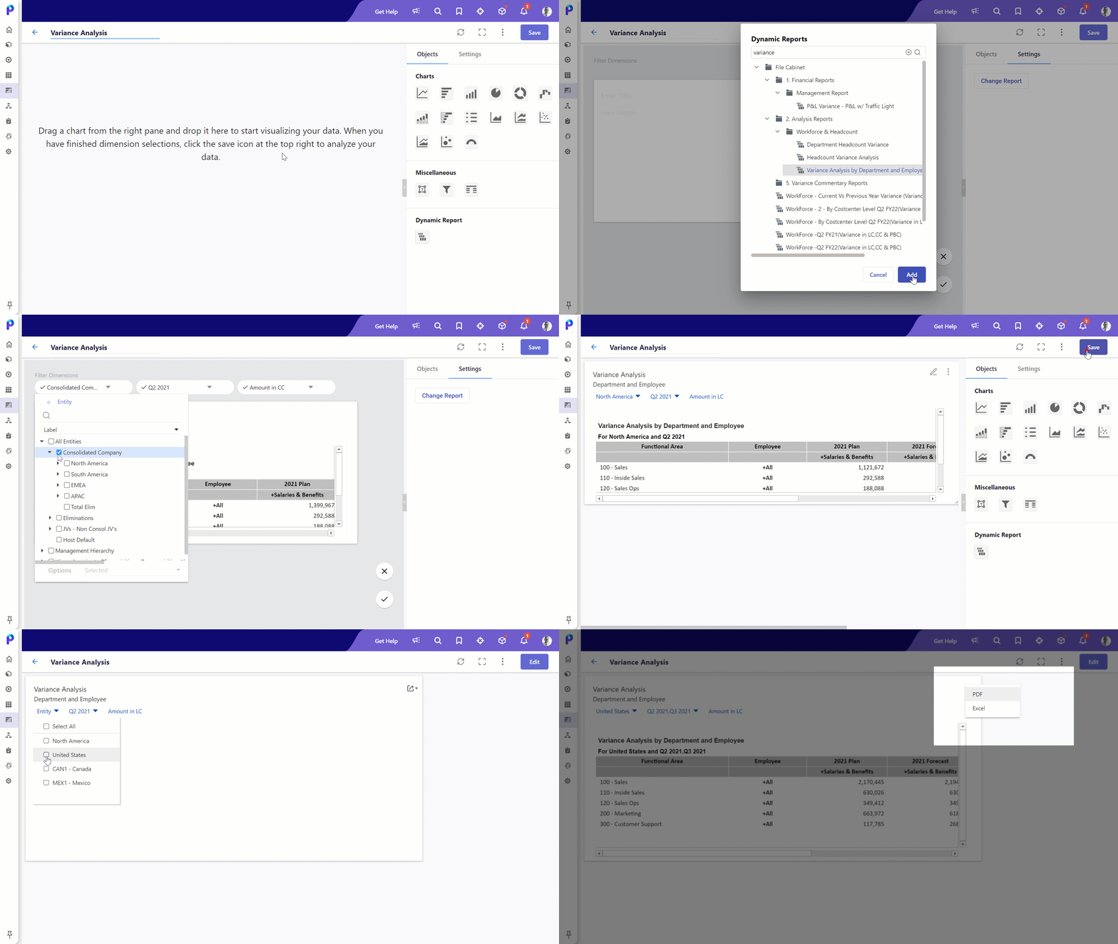
To add the dynamic report chart to your dashboard, do the following:
- Navigate to the Dashboard and click on the Add button. If you wish to add to an existing dashboard, search for the desired dashboard and click Edit.
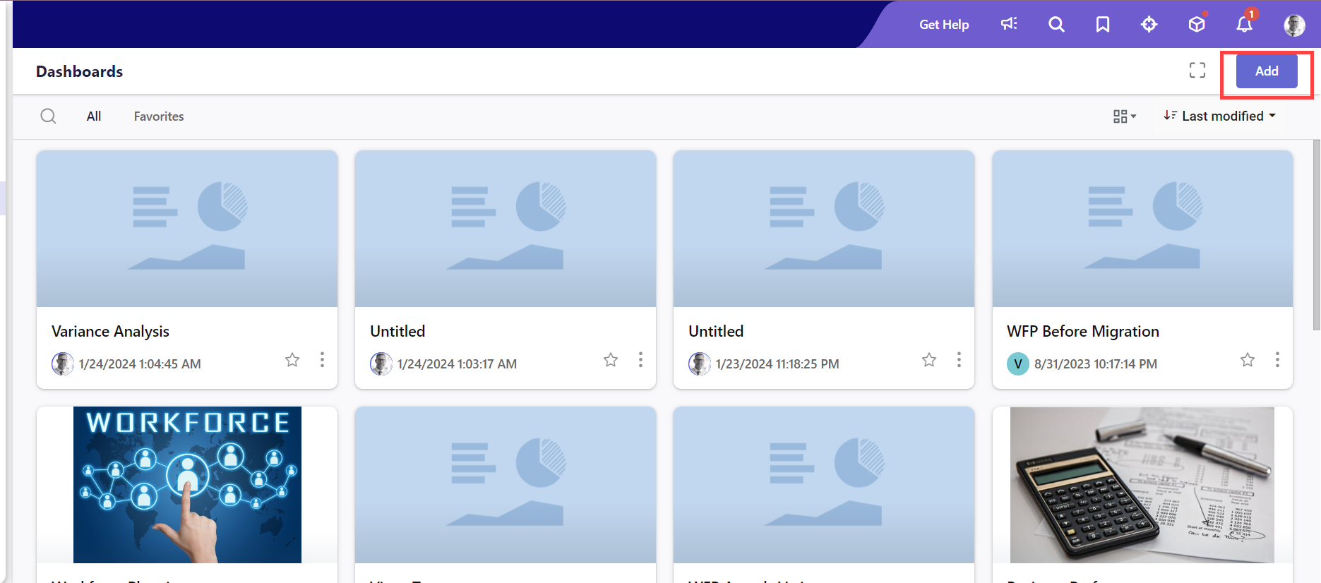
- Locate the new Dynamic Report section in the Objects menu.
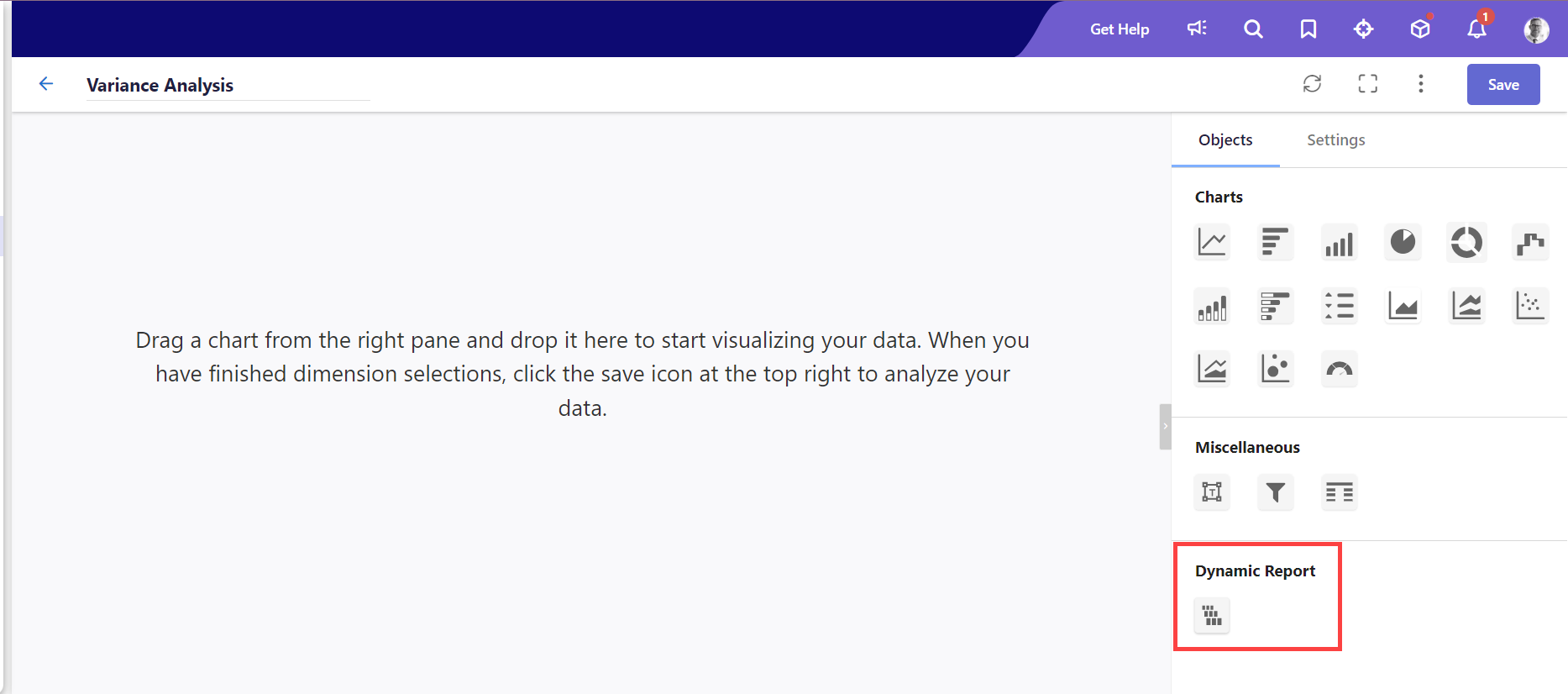
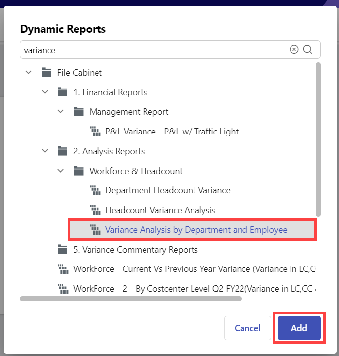
- Drag the dynamic report chart onto the dashboard. The Dynamic Reports pop-up appears.
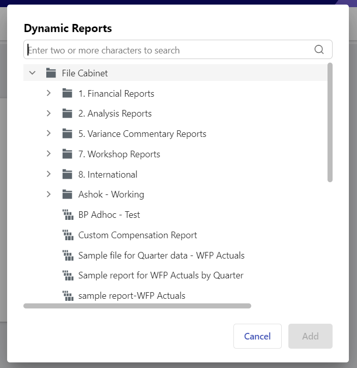
- Search and select the desired dynamic report and click Add to add the dynamic report to the dashboard.Note:You can only view and select the Dynamic Report you have access to. If you are sharing this dashboard with another user, they can view the data in this chart only if they also have access to the dynamic report.
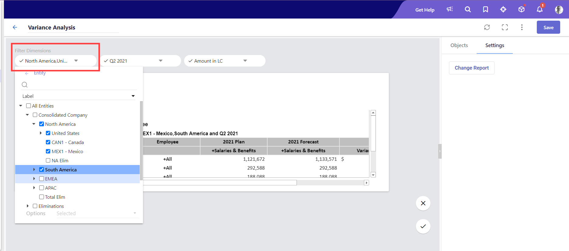
- Modify the filter dimensions and page dimensions if required.Note:
- Any selections you make for page dimensions while setting up or editing the chart will be retained, even when you change the source dynamic report's page dimensions later.
- Modifying the dimension selections of the dynamic report within the dashboard does not impact the original (source) dynamic report.
- Structural changes such as the addition or deletion of a row/column or page dimensions, made to the source dynamic report will reflect in the dynamic report you added to the dashboard, overwriting any changes made within the dashboard.
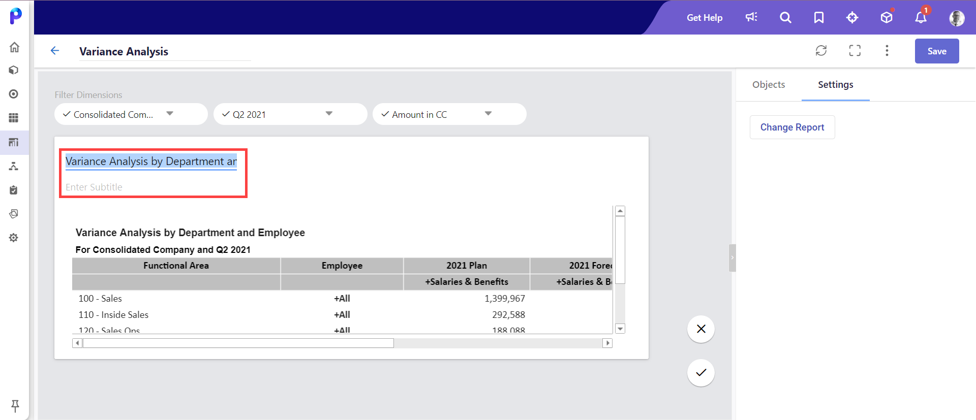
- Optionally, change the name and enter the subtitle of the dynamic report.
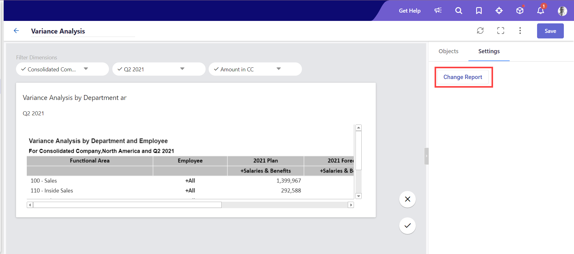
- Click Apply Changes to confirm your changes.
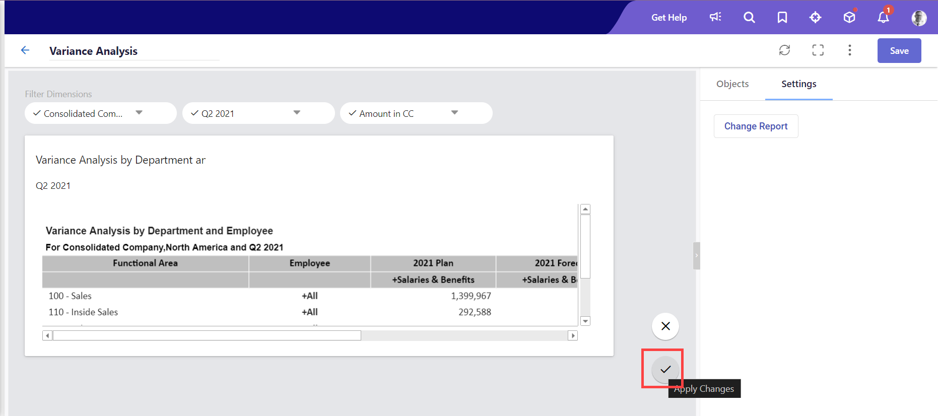 Note:If you wish to change the dynamic report, click Change Report under the Settings section before you click Apply Changes.
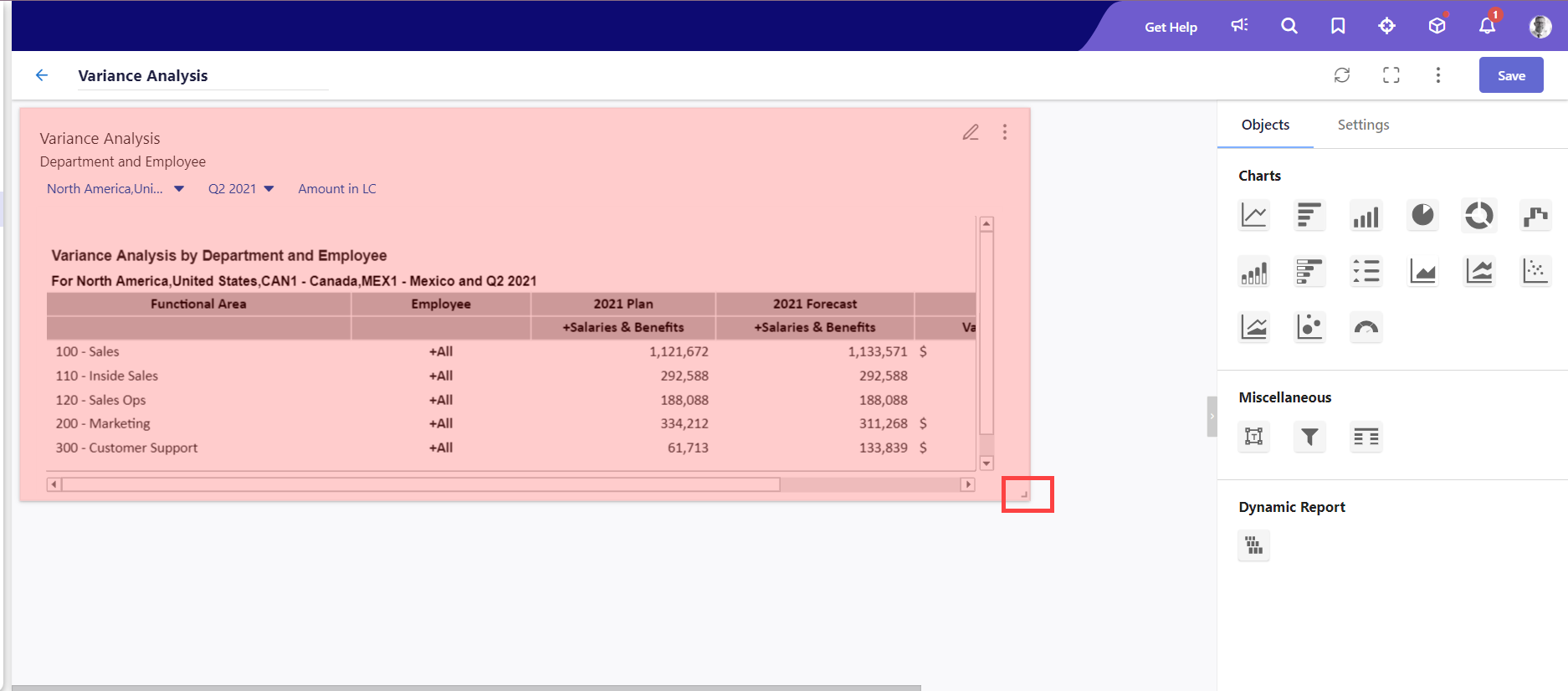
- Resize the dashboard if required.
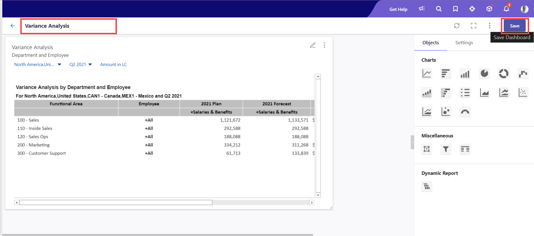
- Change the name of your dashboard and click Save to confirm your changes.
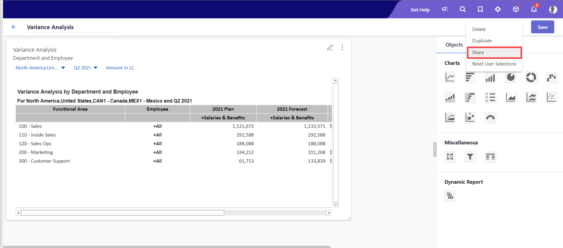
- Click the Share button to share the dashboard with others. Learn more about dashboard sharing here. Other actions include modifying filter dimensions, performing drill-throughs, and drill-downs, and exporting the dashboard in PDF or Excel.
- Any updates to page dimension selections are retained for the respective chart.
- Substitution variables for this chart cannot be edited at the dashboard level
Let’s understand this with a use case:
Consider a Variance Analysis dashboard designed for the North American region, with the United States, Canada, and Mexico shared with another user in view mode. On accessing this dashboard, the other user can adjust filter dimensions, let's say focusing solely on the Salaries & Benefits for the United States region.
On making these changes, the table chart dynamically reflects the data for Salaries & Benefits for the selected region. By hovering over Salaries & Benefits, a tooltip indicates that they can drill down for more detailed insights.
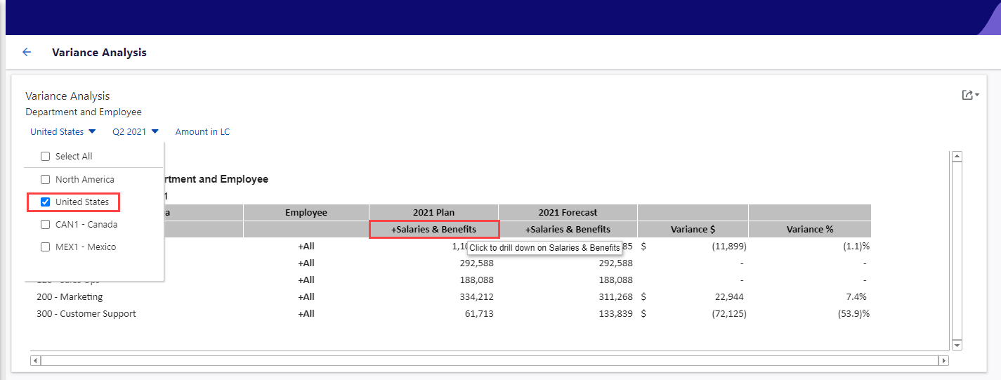
On clicking, they can see the detailed view as shown in the image below.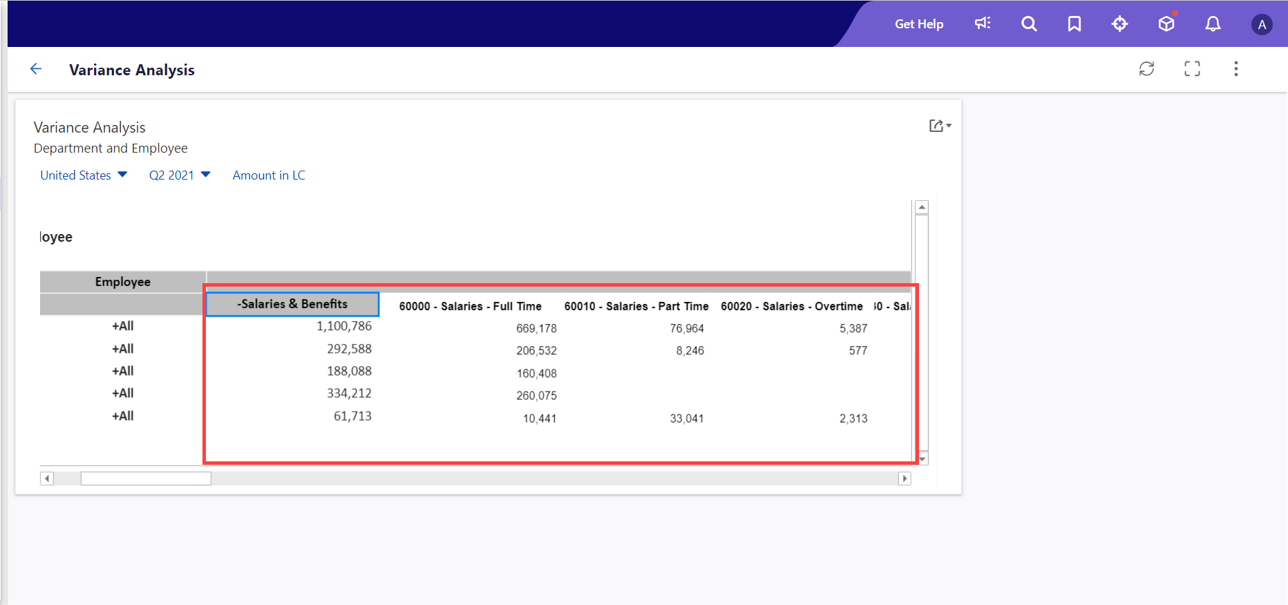
Let's see another use case where you can view predict signals within the report. On the Financial Forecast Report Dashboard, where predict signals are available, right-clicking on any value displays the Predict Signals option.
.png)
Selecting any option, like Signals for All Lines, displays the signals as shown in the below image.
.png)

