Dynamic Planning How to Add a Chart to a Report
- 1 Minute to read
- Print
- DarkLight
- PDF
Dynamic Planning How to Add a Chart to a Report
- 1 Minute to read
- Print
- DarkLight
- PDF
Article summary
Did you find this summary helpful?
Thank you for your feedback
To add a chart to a report, you must be logged into SpotlightXL and have user access to design reports.
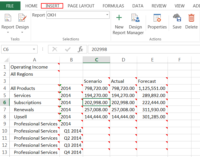
- While Designing the Report, click the Insert menu tab.

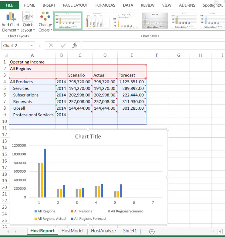
- Click Bar and select 2-D Bar chart. You may have up to 4 charts per analysis. See Chart Formatting and Types for other types of charts supported.
- Drag the chart to position it within the spreadsheet. Format the report as desired. For example, insert columns and rows, change the font size, or insert a background color.

- Click the SpotlightXL tab and click Save. Select Run from the subtask selections to view the results of your work.
Was this article helpful?

