- 1 Minute to read
- Print
- DarkLight
- PDF
How to Build a Workforce Dashboard
- 1 Minute to read
- Print
- DarkLight
- PDF
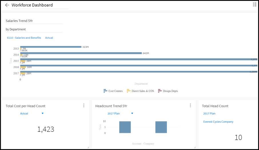
Situation: Extrapolate information on the following data:
Salary trends by department
Total cost per headcount
A 5 year headcount trend
Total headcount
Resolution:
To achieve the resolution below, see the steps to create the dashboard.

Steps to Create the Dashboard
Step 1: Load the Latest Data to Planful
Whether you use Data Load Rules, Web Services, or Cloud Services, ensure all data is loaded to the Planful application.
Step 2: Security and Navigation Access
See the Dashboards Admin Guide for information on data security and Dashboards navigation access.
Step 3: Build the Dashboard
From the Organizer, click the Add button.
Enter a name. For example, Workforce Dashboard.
Click the Chart icon.
Step 4: Build the Charts
There are 4 charts on the dashboard;
Salaries 5 Yr Trend by Department
Total Cost per Headcount
Headcount Trend
Total Headcount

Step 6: Recreate the Dashboard:
Drag the line chart to the canvas and drop it.
Select Settings and select the Workforce Reporting Area.
Enter Salaries 5 Year Trend by Department for the custom X axis name.
Click Add Dimensions and select CompensationItem.
Click CompensationItem and select the Salaries and Benefits member.
Add a second dimension to the X axis by clicking Add Dimension and selecting the Department dimension.
Select the Cost Centers, Direct Sales & COS and Design Depts members.
On the Y axis, select the Scenario dimension. Select the Actual member.
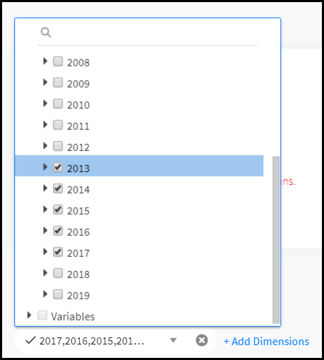
On the Y axis, select the Time dimension.
Click the Time dimension and select 5 years as shown below.

Click the tick (checkmark) to save the chart.
Continue to build other charts.
Click Save.
Now you can share your dashboard with other users and add a thumbnail.

