Predict Signals in DAP (Direct Access to PCR) Reports
- 4 Minutes to read
- Print
- DarkLight
- PDF
Predict Signals in DAP (Direct Access to PCR) Reports
- 4 Minutes to read
- Print
- DarkLight
- PDF
Article summary
Did you find this summary helpful?
Thank you for your feedback
There are two methods to access the Predict Signals option in DAP Reports. Firstly, you can select Predict Signals from the menu bar. Alternatively, you can right-click on any cell in the report and choose the Predict Signals option. This functionality supports different types of members, such as:
- Roll-up members
- Leaf-level members
- Calculated members
- Substitution or derived variables
- Simple user-defined custom formula members
The Predict Signals options provide the following functionalities:
- Signals For All Lines: Generates signals instantly for smaller reports with up to 50 lines. It applies the logic to obtain predicted signals for all lines in the report.
- Signals For Selected Line(s): Allows you to check signals for a maximum of 10 lines simultaneously. It applies the logic to obtain predicted signals for the selected lines in the report.
- Hide Signals: Removes signals from the report.
Highlighted cells indicate the presence of signals. Right-clicking on these cells offers two actions: resolving the signal or selecting the Signal Context screen option. Selecting the Signal Context screen option navigates you to the Signal Context screen for a more comprehensive analysis.
Signals For All Lines & Signals For Selected Line(s)
The Signals For All Lines and Signals For Selected Line(s) feature allows you to access signal data either for a specific line or for all lines, offering flexibility in selecting the lines you want to analyze for signal information.
In Practice: Access the Predict Signals in DAP (Direct Access to PCR) Report For All Lines or For Selected Line(s)
- Navigate to the Reports section.
.png)
- Select a DAP (Direct Access to PCR) report from the options in the Report drop-down list.
.png) Note:The Predict Signals feature is accessible only when you open a DAP (Direct Access to PCR) Report in Run mode.
Note:The Predict Signals feature is accessible only when you open a DAP (Direct Access to PCR) Report in Run mode..png)
- From the Predict Signals drop-down list, select either Show Signals for all lines or Signals For Selected Line(s).
.png)
Hide Signals
The Hide Signals feature allows you to remove displayed signals from the report. It becomes available when there is at least one signal shown. Selecting this option makes the signals invisible, providing a cleaner report view. Once you click on Hide Signals, the signals will be hidden throughout the report and will not be visible to you. The signals can be shown again by selecting the Show Signals option for all lines or selected lines.
In Practice: Hide Signals from Report
- Open the required DAP (Direct Access to PCR) Report.
- Click Predict Signals drop-down list and select Hide Signals.
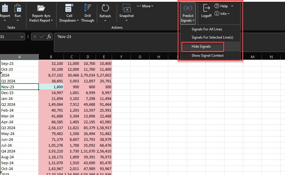
- Alternatively, you can right-click on any cell and navigate to SpotlightXL > Predict Signals > Hide Signals.
.png)
- The signals are hidden from the report.
.png)
Signals Context
The Signal Context screen provides a comprehensive view of signals, presenting dimensions, a data table, and a graph with essential information. The Data table includes the following:
- The Budget/Forecast scenario for the entire fiscal year of the selected row
- The upper and lower ranges generated by the AI engine
- The historical actuals used for Model Training
Note:
The historical actuals are displayed only up to the past six years.
The graph visually represents the same information that justifies its identification as a signal. By default, the graph displays the upper and lower ranges along with the forecast scenario. However, clicking on the actual data label above the graph allows you to view the historical actuals.
This screen displays data for all months in the fiscal year, providing insights into trends and seasonality. You can compare selected dimension data with historical actuals, multiple years, and the selected scenario, gaining valuable insights into each signal.
Additionally, you can download a snapshot of the signal context by clicking on the PDF icon available on the Signal Context screen. This allows you to have offline access and reduces dependency on application availability.
By clicking on any row in the Signal Context screen, you can view the complete dimensions of the corresponding signal, along with a data table and a graph displaying all the necessary signal information. The data table includes the following:
- Actual Value
- Upper Range
- Lower Range
- Variance
- Actual Values of the preceding three financial years were used to estimate the Signal Values
The graph visually displays signal information, allowing identification. Clicking on the actual data label reveals historical actuals. The window displays data for all months in the fiscal year, analyzing trends and seasonality. Comparing selected dimension data with historical actuals, multiple years, and scenarios provides valuable insights into each signal.
In Practice: Signal Context Screen
- Click on the required cell and navigate to Predict Signals > Show Signal Context.
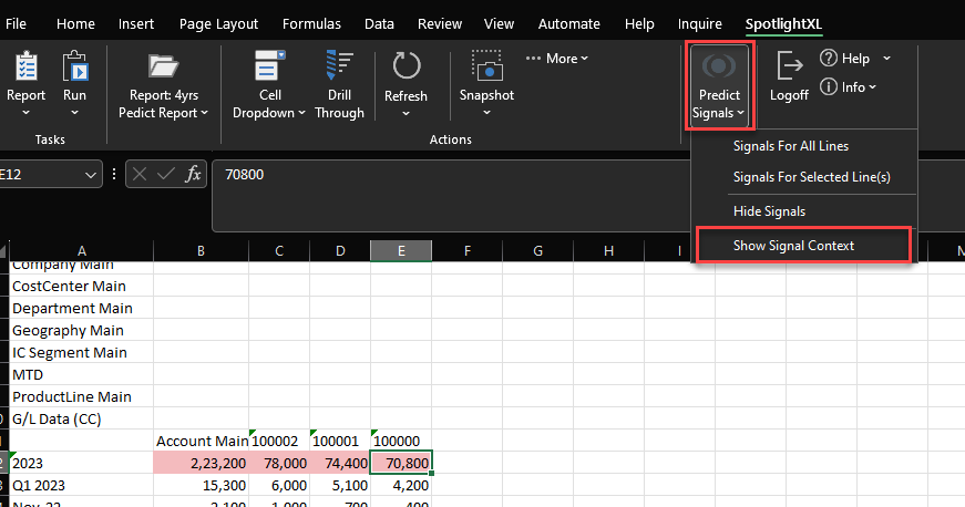
- Alternatively, you can right-click on the required cell and go to SpotlightXL > Predict Signals > Show Signal Context.
.png)
- The table and graph view of the selected cell appears.
.png)
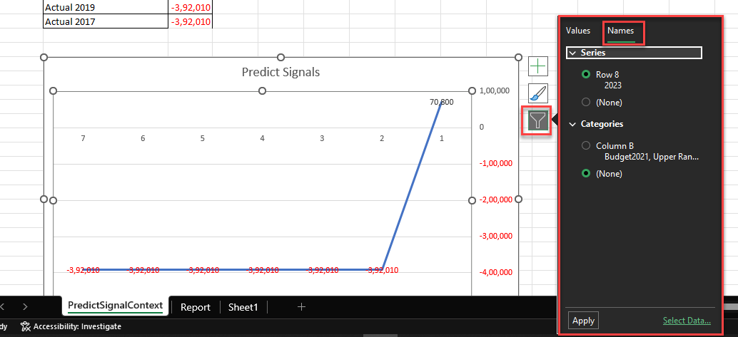
In Practice: Filter option on Signal Context Screen
- Navigate to the Signal Context screen graph view and click on the filter icon.
- A small window will appear.
- Under the Values section, you can select the necessary checkboxes for Series and Categories.
.png)
- After applying the required filter, click Apply.
- Optionally, you can select the required data by clicking Select Data.
- In the Select Data Source window, you can switch the Row/Column as needed.
- After making the necessary changes, click OK.
.png)
- Under the Names section, you can select the necessary checkboxes for Series and Categories.
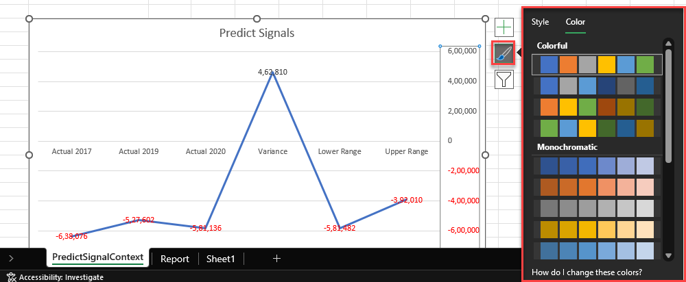
In Practice: Edit option on Signal Context Screen
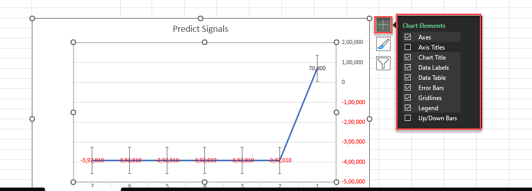
- Navigate to the Signal Context screen graph view and click the Edit icon.
- A small window will appear, providing options for Style and Color selection.
- In the Style section, you can choose from various available graph styles.
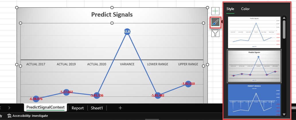
- In the Color section, you can select from a range of different colors.
- Optionally, click the + icon to add different Chart Elements for further customization.
Was this article helpful?