- 4 Minutes to read
- Print
- DarkLight
- PDF
Syncing MyPlan and Planning Application Template Data
- 4 Minutes to read
- Print
- DarkLight
- PDF
Once you have completed the four steps above to configure the MyPlan Interface, there is one more step that must be completed. Based on the current configuration setup you just completed, if you tried to open a template in MyPlan you will not see any data. This is because you created scenarios and seeded data to populate the newly created scenarios. In order for the MyPlan Only templates to be populated with data, they have to be opened and saved. To avoid opening and saving each template manually, create and run a Simulation Engine process (this is the same methodology used when scenarios are created for use in the Planning application). It is a best practice to create a MyPlan Only Simulation Engine process for all budget entities and templates or you can open and save all the templates manually, which is not recommended.
Simulation processing is an automated way of saving templates. This process helps to re-compute and save template data based on changes to the reference data or other global drivers. The Simulation Engine processes templates automatically instead of manually opening and saving the templates in order of dependency.
Everything you need to know about Simulation Engine is provided in the Simulation Engine Guide. Information on steps to create a Simulation Engine process and additional detail on what happens behind the scenes when you execute a Simulation Engine process is provided within this guide.
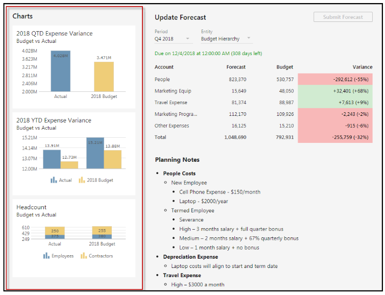
Just like other areas related to MyPlan, it is a best practice to create MyPlan Only dashboards. Once again, the dashboards should be specific and have meaningful information for casual business users. What’s important to know is when you create a MyPlan Only dashboard, the entire dashboard is what will be seen in MyPlan. Currently, you cannot select certain charts or graphs to be included in MyPlan, so the entire dashboard is brought over and displayed. MyPlan currently allows up to three charts or graphs (this will change in future releases). From a security perspective, MyPlan will use the reporting and dimension security currently set up within the application. If you are unfamiliar with working with Dashboards, please see the Dashboards Admin Guide located on the help for detailed information.
How the dashboards are displayed in MyPlan:

Certain criteria need to be considered when designing a dashboard for use in MyPlan. Future releases will allow additional functionality and flexibility, so please beware of the following topics related to best practice setup.
Shared Mode
Once your Dashboard has been created, it must be shared with “Everyone ” in order for the charts associated within the dashboards to be displayed in MyPlan.
To share a dashboard, complete the follow steps:
Step 1: In the Planning application, access Dashboards.
Step 2: Click the 3 dots on the dashboard you want to share and select Share.
Step 3: The Share Selected page appears. Select the Contributor or MyPlan Only users to share the dashboard with.
For detailed information on dashboard sharing, see the Dashboards Admin Guide and the Dashboards End-User Guide.
Number of Charts and Chart Size Limitation per Dashboard
When you create a dashboard for MyPlan consumption, it is a best practice to create up to 3 charts, because only up to 3 charts can be displayed in MyPlan at a time (as shown above). If you add more than 3 charts, only the first 3 will be displayed in MyPlan. If you need additional charts displayed you can easily create a MyPlan configuration and configure two sections to display chart data. Because there is a limitation of space in each MyPlan section, when you create a dashboard for MyPlan, keep the size in mind by displaying only one or two dimensions per chart axis. Additionally, if you create a chart with 50 columns and rows, for example, it will not display properly in MyPlan. It is best practice to test the look and feel of the Dashboard charts before rolling it out to users.
Chart Settings/Properties
When creating charts, you can select from several Settings / Properties options.
Step 1: Select a chart to display the Settings tab and click Properties as shown below.
Step 2: It is recommended that you turn Data Labels off as they take up additional chart space.
Step 3: Additionally, scale the Axis Min and Max while keeping chart space in mind. It is a best practice to use the bar chart type for most data. The Gauge chart type can be used to display data nicely as well. Other chart types may not display data well due to limited spacing, but please feel free to test them out based on your data needs.
- Only the U.S. formatting culture is supported at this time.
- You cannot give users read-only access to a template used in MyPlan. Users must have edit access.
- All workflow actions are not available at this time.
- Only 12-month period applications are supported at this time.
- MyPlan can only be used with debit accounts (expenses). Credit accounts will be added shortly.

